Feature engineering days_elapsed by finding the difference between when a 311 service request was created through aug[‘created_date’] and when the service request was closed through aug[‘closed_date’] gives us another interesting feature to look at.
import pandas as pd
import numpy as np
import datetime
import matplotlib.pyplot as plt
import seaborn as sns

aug['days_elapsed'] = (aug['closed_date'] - aug['created_date']).dt.days
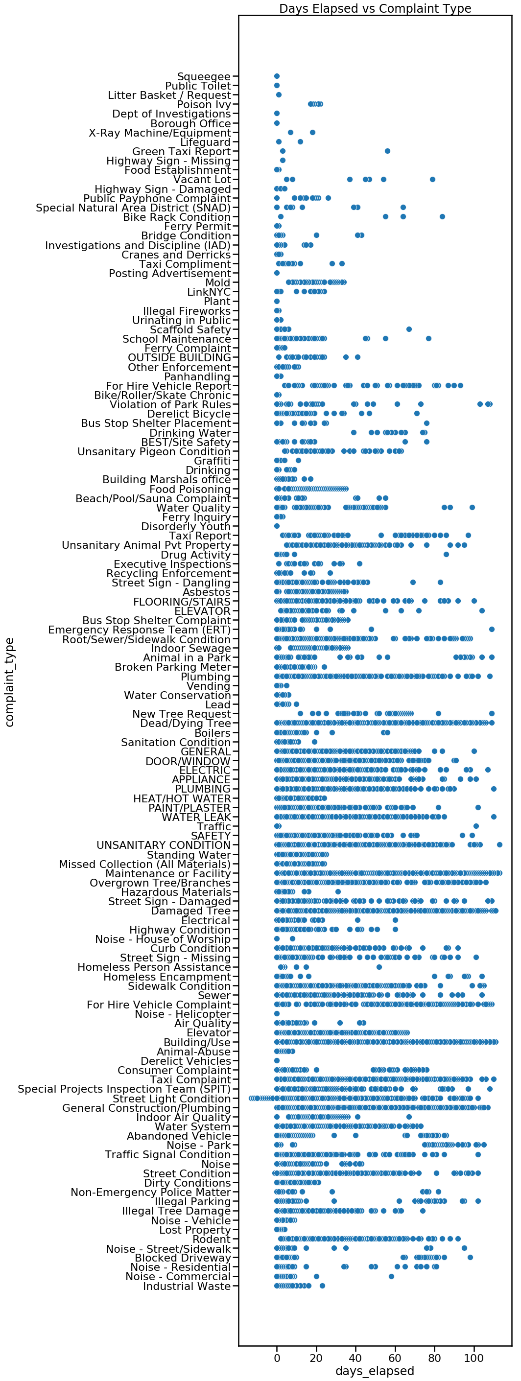
(aug[‘closed_date’] – aug[‘created_date’]).dt.days returns an integer where we can make visulizations. A scatter plot of raw data of complaint type and days_elapsed, shows the spread of how long a specific type of complaint took to resolve.
plt.figure(figsize= (8,40))
sns.scatterplot(y=aug['complaint_type'], x=aug['days_elapsed']).set_title('Complaint Type vs Days Elapsed ')
We can also look at the raw data of days_elapsed vs agency in a scatterplot.
plt.figure(figsize= (8,16))
sns.scatterplot(y=aug['agency'], x=aug['days_elapsed']).set_title('Agency vs Days Elapsed')

Instead of raw data, perhaps the mean will be more insightful. This is done by first grouping our dataframe by complaint_type using aug.groupby([‘complaint_type’]). From there we can specify which feature we want to look at, in this case, days_elapsed. We find the mean of each complaint type by attaching .mean() to the end of our code thus far. Adding .sort_values(acending=False) will sort our values from highest to lowest.
complaint_mean = aug.groupby(['complaint_type']).days_elapsed.mean().sort_values(ascending=False)
complaint_mean
complaint_mean will return the complaint_type and the mean of days_elapsed. The first line complaint_mean returns is “For Hire Vehicle Complaint – 65.” We take the complaint_mean.values which is 65 in our first example and complaint_mean.index which is For Hire Vehicle Complaint in our first example. Using seaborn (sns) we set complaint_mean_values as X and complaint_mean.index as Y. Finally, plt.text(63, .2, r’$65$’) places text ’65’ at the end of the first bar. The specific number (65) is taken from complaint_means.
plt.figure(figsize=(10,50))
sns.barplot(complaint_mean.values, complaint_mean.index, alpha=0.8)
plt.title('Avg Days Elapsed By Complaint Type')
plt.ylabel('Complaint Type', fontsize=12)
plt.xlabel('Avg Days Elapsed', fontsize=12)
plt.text(63, .2, r'$65$')
plt.text(61.5, 1.2, r'$63$')
plt.text(58.5, 2.2, r'$60$')
plt.text(56.5, 3.2, r'$58$')
plt.text(53.5, 4.2, r'$55$')
plt.text(41.5, 5.2, r'$43$')
plt.show()

We can also group by agency and see if there is a noticeable difference between agencies. Which agency closes their requests the slowest or the fastest?
agency_mean = aug.groupby(['agency']).days_elapsed.mean().sort_values(ascending=False)
agency_mean
plt.figure(figsize=(10,20))
sns.barplot(agency_mean.values, agency_mean.index, alpha=0.8)
plt.title('Avg Days Elapsed By Agency')
plt.ylabel('Agency', fontsize=12)
plt.xlabel('Avg Days Elapsed', fontsize=12)
plt.text(32, 0, r'$34$')
plt.text(25, 1, r'$26$')
plt.text(22, 2, r'$23$')
plt.text(19, 3, r'$20$')
plt.text(12.5, 4, r'$13$')
plt.text(12.5, 5, r'$13$')
plt.text(10, 6, r'$11$')
plt.text(6.5, 7, r'$7$')
plt.text(1.2, 8, r'$2.6$')
plt.text(1.1, 9, r'$2.4$')
plt.text(1.1, 10, r'$2.4$')
plt.text(.2, 11, r'$1.5$')
plt.text(.6, 12, r'$0.28$')
plt.show()

Here is a visualization by borough. We can look at the total average of days_elapsed by borough. Does one borough address their 311 service requests faster on average than another borough? b_mean = b_mean[1:6,] eliminates “unspecified” borough which had the highest number of average days elapsed.
b_mean = aug.groupby(['borough']).days_elapsed.mean().sort_values(ascending=False)
b_mean = b_mean[1:6,]
b_mean

plt.figure(figsize=(10,10))
sns.barplot(b_mean.values, b_mean.index, alpha=0.8)
plt.title('Avg Days Elapsed By Borough')
plt.ylabel('Borough', fontsize=12)
plt.xlabel('Avg Days Elapsed', fontsize=12)
plt.text(6.5, 0, r'$6.88$')
plt.text(6.1, 1, r'$6.51$')
plt.text(5.9, 2, r'$6.32$')
plt.text(5.5, 3, r'$5.88$')
plt.text(5.2, 4, r'$5.65$')
plt.show()

We can break this down further and take a look at how diligently each agency performs based on borough. Our first line of code, takes the variable bronx and returns a dataframe of 311 service requests from the Bronx. This is repeated for each borough.
bronx = aug.loc[aug.borough=='BRONX']
brooklyn = aug.loc[aug.borough=='BROOKLYN']
manhattan = aug.loc[aug.borough=='MANHATTAN']
queens = aug.loc[aug.borough=='QUEENS']
staten = aug.loc[aug.borough=='STATEN ISLAND']
The following is repeated a total of five times for each borough.
agency_mean = bronx.groupby(['agency']).days_elapsed.mean().sort_values(ascending=False)
print(agency_mean)
plt.figure(figsize=(5,10))
sns.barplot(agency_mean.values, agency_mean.index, alpha=0.8)
plt.text(49, .025, r'$52$')
plt.text(27, 1.1, r'$30$')
plt.text(23, 2.1, r'$26$')
plt.text(16, 3.1, r'$19$')

plt.title('Bronx: Avg Days Elapsed By Agency')
plt.ylabel('Agency', fontsize=12)
plt.xlabel('Avg Days Elapsed', fontsize=12)
plt.show()
Here is our final visualization. TLC is consistently the slowest of all agencies to close their 311 service requests, as it has the highest average days_elapsed in 4 out of 5 boroughs. Dept of Hygiene and Mental Health (DOHMH) also alternates between the 2nd and 3rd slowest agency in all five boroughs. The agency that has the lowest average days_elapsed to close a 311 service request is the NYPD, which is the lowest in every borough.

