Featured

Revisiting NYC’s OpenData on 311 Service Requests

https://opendata.cityofnewyork.us/

While studying in an immersive Data Science bootcamp program, one of my projects I worked on had to specifically use classification variables. An example of a classification variable is hot dog vs not hot dog. This is different from continuous variables such as predicting the sale price of your car based on make, model, year, etc. The sales price is an integer and it is continuous. In my project I took a look at 311 Service Requests in NYC made specifically on March 11, 2019, which was the start of my Data Science bootcamp. I feature engineered a new feature named Resolution Outcome based on contents of the resolution description. An example of a negative (0) resolution was “The NYPD responded but upon arrival those responsible were gone.” An example of a positive (1) resolution was “The DOT responded to the complaint and took action to fix the condition.”

Other features found in the data were:
Agency: NYPD, Dept of Transportation, Dept of Health & Mental Hygiene, Dept of Sanitation, Dept of Housing Preservation and Development, Dept of Parks and Recreation, etc
Borough: Brooklyn, Queens, Manhattan, Bronx, Staten Island
Location: Longitude/Latitude, Cross Streets, Intersections
Created/Closed Date
Complaint Type: Heat/Hot Water, Rodent, Noise, Street Condition, Illegal Parking, Unsanitary Condition, Blocked Driveway are just a few examples.
Resolution Description: Described what was done in response to the 311 service request.

I created several machine learning models, such as logistic regression, decision trees, random forest, K nearest neighbor and XGBoost, to predict what was the most influential feature that determined whether a person would have a positive or negative resolution outcome to their 311 service request. You can check out my github for the project here or my medium blog about it here.

That was then, this is now

There were several next steps that I wanted to take following my project. The fact that this project only looks at a single day of data greatly limits its scope. The most frequent complaint of HEAT/HOT WATER is probably highly correlated with the month and winter season. It might be a safe assumption to say that the number one complaint may be completely different if this data took a look at a day in the middle of summer. Would the number one complaint be Noise?

So my first step is to write out a function to get multiple days worth of data from NYC’s OpenData. OpenData has an api that returns 1,000 results from your query. My original criteria was 311 Service requests made on March 11th. Using python and pandas, this is how I retrieved this information:

url = "https://data.cityofnewyork.us/resource/fhrw-4uyv.json?$where=created_date%20between%20%272019-03-11T00:00:00%27%20and%20%272019-03-12T00:00:00%27"
data = pd.read_json(url)

The created date is between “2019-03-11T00:00:00,” which is midnight of March 11th to “2019-03-12T00:00:00,” which is midnight of March 12th. This creates a pandas dataframe named data with the first 1,000 results. One of the features from the data is the created_date which included the date and the time of the 311 service request.

data.created_date[999]

Returns a string of “2019-03-11T07:50:45.000“. Which means the first 1,000 results are 311 service requests made from midnight to 7:50am. To get the next set of 1,000 results, I would then need to change my created date to no longer start from midnight of March 11th. I would need to change it to start at 7:50 am. My new url would be created from “2019-03-11T07:50:45” and still end at midnight of the 12th.

To make this more dynamic, I created a function that would take input for the start_date and the end_date. I will be able to specify if I want data from just one day, or perhaps two days, or even a whole month. I would retrieve that data 1,000 results at a time by dynamically changing the created_date on the url to the last date found in data.created_date[999].

def three_one_one(start_date, end_date):
     url = "https://data.cityofnewyork.us/resource/fhrw-4uyv.json?$where=created_date%20between%20%272019-" + start_date + "T00:00:00%27%20and%20%272019-" + end_date + "T00:00:00%27"
     data = pd.read_json(url)

     last_date = data.created_date[999]
     while last_date:
          new_url = "https://data.cityofnewyork.us/resource/fhrw-4uyv.json?$where=created_date%20between%20%27" + last_date + "%27%20and%20%272019-" + end_date + "T00:00:00%27"

I set last_date as the variable name for data.created_date[999]. In new_url I have replaced start_date with last_date, therefore when I retrieve the new_url, it will start at 7:50am from the previous example.

          data1 = pd.read_json(new_url)
          print("data1 shape:" data1.shape)
          data = pd.concat([data, data1], join="inner", axis=0)

I save the data from the new_url to a dataframe named data1. data1.shape tells me how many rows and features I have in my dataframe. In this case, there are 1,000 rows and 37 features. This data1 will always have 1,000 rows because that is the maximum amount of information OpenData allows me to retrieve at a time.

         data = pd.concat([data, data1], join="inner", axis=0)
         print("concat data shape:", data.shape)

Concat joins both dataframes, data and data1, together and saves the combined dataframe as data. An “inner” join returns all rows from both the participating tables where the key record of one table is equal to the key records of another table.  Now when I check how many rows and features I have in my data dataframe, there should now be 2,000 rows and 37 features. The number of rows in data.shape will keep increasing as we run this function again to keep adding more data. While data1.shape will always max out at 1,000. data.shape is useful to verify that the function is working and that we are increasing the amount of data we are adding to our dataframe.

        data.to_csv('311_' + start_date + '_to_' + end_date + 'function.csv', index=False)
        print("saved to csv")
        time.sleep(3)

data.to_csv saves our dataframe as a csv file and time.sleep(3) forces a pause before the function runs again. I put a pause there so opendata does not block me for making too many requests in a very, very short time period.

        new_last_date = data1.created_date[999]
        last_date = new_last_date

Finally, we take the 1,000th entry from data1 which is the last date in the dataframe, and use it as the new “start date” to be able to run the function again and again, until our inputted end_date.

Here is the function in its entirety:

def three_one_one(start_date, end_date):
    url = "https://data.cityofnewyork.us/resource/fhrw-4uyv.json?$where=created_date%20between%20%272019-" + start_date + "T00:00:00%27%20and%20%272019-" + end_date + "T00:00:00%27"
    data = pd.read_json(url)
    print("this is the first url:", url)
    print("this is the start date:", start_date)
    print("data shape is:", data.shape)
    
    last_date = data.created_date[999]
    while last_date:
        new_url = "https://data.cityofnewyork.us/resource/fhrw-4uyv.json?$where=created_date%20between%20%27" + last_date + "%27%20and%20%272019-" + end_date + "T00:00:00%27"
        print("this is the new url:", new_url)
        print("this is the last_date:", last_date)
        data1 = pd.read_json(new_url)
        print("data1 shape:", data1.shape)
        data = pd.concat([data, data1], join="inner", axis=0)
        print("concat data shape:", data.shape)
        data.to_csv('311_' + start_date + '_to_' + end_date + 'function.csv', index=False)
        time.sleep(3)
        new_last_date = data1.created_date[999]
        print("this is the new last date:", new_last_date)
        last_date = new_last_date
        
    else:
        print("else statement, done!")
    return data.tail(10)

My original project looked at one day in March. Now, I wanted to look at a different month, specifically, in a different season. Since it is the most recent, I wanted to take a look at a week in October, or perhaps, the entire month. I was debating whether or not I should feature engineer resolution_outcome again, but with all this new data, I can begin by simply exploring what the data presents. I did notice that some of the features have changed since March. There is now a feature named open_data_channel_type which states whether the 311 service request was made through the phone, online or mobile. Do the residents of Brooklyn use mobile more than other boroughs? There is also a resolution_action_updated_date which would also bring interesting time insights. At the very least we can see how fast a status can be “closed.”

That’s it for now….more to come in the next few weeks.

Healthcare Provider Fraud: Exploring the Outpatient Data

I explored the Inpatient data in my previous blog. Let’s take a look at the outpatient data.


tr_out = pd.read_csv('Train_Outpatientdata-1542865627584.csv')
print(tr_out.shape)
tr_out.head()

(517737, 27)

This is a much bigger data set than the inpatient data set. Outpatient has 517,737 rows of data, whereas inpatient only had 40,474 rows. This is not surprising as there are many advantages to having outpatient care instead of inpatient care when it is possible. One advantage of outpatient care is the patient will be able to recover in the comfort of their own home and recuperate in their favorite couch, chair, or bed and enjoy their own food rather than hospital food.

Let’s move on to the features/columns.

tr_out.columns

Outpatient has fewer columns than inpatient. It does not have AdmissionDt and DischargeDt for starters. It does have ClaimStartDt and ClaimEndDt and using datetime I want to also calculate the Claim_Days_Elapsed similar to how it was done with inpatient data. I also want to flag this data as Outpatient.

tr_out['ClaimStartDt'] = pd.to_datetime(tr_out['ClaimStartDt'])
tr_out['ClaimEndDt'] = pd.to_datetime(tr_out['ClaimEndDt'])
tr_out['Claim_Days_Elapsed'] = (tr_out['ClaimEndDt'] - tr_out['ClaimStartDt']).dt.days

tr_out['Inpatient'] = 0
tr_out['Outpatient'] = 1

With feature engineering, the total number of features comes to 30. The next step I take is determine how many null values I have in my features. tr_out.isna() will return True/False on null values for the entire dataframe. Adding .sum() returns a number, instead of a boolean dataframe. Finally, I multiply this number by 100 then divide it by the length of tr_out to find the percentage of null values.

tr_out.isna().sum()*100/len(tr_out)

Comparing the number of physicians between outpatient vs inpatient:

There are 5,012 unique providers in the outpatient data compared to 2,092 unique providers in the inpatient data. I want to see how many claims the top providers have.

plt.figure(figsize=(10,5))
sns.barplot(tr_out.Provider.value_counts().values[:10],tr_out.Provider.value_counts().index[:10] )
plt.title('# of Claims by Provider (Outpatient)')
plt.xlabel('# of Claims')
plt.ylabel('Provider')

The top provider has over 8,000 claims. This is followed by two providers having over 4,000 claims. However, similar to the inpatient data, if we take a look at the top 100 providers, the claim count per provider is much lower.

To view the top 100 instead of the top 10, we change the following one line of code

sns.barplot(tr_in.Provider.value_counts().index[:100],tr_in.Provider.value_counts().values[:100] )

We can also check the number of claims each patient has.

mult_cl_out = tr_out.groupby('BeneID')['ClaimID'].nunique().sort_values(ascending=False)
mult_cl_out.head(15)

plt.figure(figsize=(5,8))
sns.barplot(mult_cl_out.values[:50], mult_cl_out.index[:50])
plt.title('# of Claims By BeneID (Outpatient)')
plt.xlabel('# of Claims')
plt.ylabel('BeneID')

The top 50 Outpatients have over 20 claims, whereas the top 50 Inpatients have 5 or more.

Finally, we will use .intersection to see which features the inpatient and outpatient data frames have in common.

set(tr_in.columns).intersection(set(tr_out.columns))

Seeing the number of features that inpatient and outpatient have in common, .difference might be more useful and easier to distinguish between the two dataframes.

set(tr_in.columns).difference(set(tr_out.columns))
{'AdmissionDt', Admitted_Days', DiagnosisGroupCode', DischargeDt'}

are the only features that do not appear in both data frames. This information is important because out next step will be to combine all the data frames. We have four different dataframes. Our train dataframe contains the features Provider and PotentialFraud. The tr_ben dataframe contains features such as BeneID, DOB, DOD, Gender and Race. Next week we will combine the Inpatient, Outpatient, and tr_ben dataframe to join all features based on similar BeneIDs. Finally we will add whether a provider has been flagged for PotentialFraud by joining that new dataframe with the train dataframe based on similar Provider information.

Healthcare Provider Fraud: Exploring the Inpatient Data

As we continue our project on Healthcare Provider Fraud Detection, we explore the remainder of our data. We have two csv files, one for Inpatient data and the other for Outpatient data. Let’s load in our data, take a look at its shape and the dataframe itself.

tr_in = pd.read_csv('Train_Inpatientdata-1542865627584.csv')
print(tr_in.shape)
tr_in.head()

We have 40,474 rows of data with 30 features. The features that immediately stand out to me are ClaimStartDt and ClaimEndDt as well as AdmissionDt and DischargeDt. Let’s turn those features to a datetime format and calculate the elapsed time between the end date and the start date. We create two new features Claim_Days_Elapsed and Admitted_Days.

tr_in['ClaimStartDt'] = pd.to_datetime(tr_in['ClaimStartDt'])
tr_in['ClaimEndDt'] = pd.to_datetime(tr_in['ClaimEndDt'])
tr_in['Claim_Days_Elapsed'] = (tr_in['ClaimEndDt'] - tr_in['ClaimStartDt']).dt.days

tr_in['AdmissionDt'] = pd.to_datetime(tr_in['AdmissionDt']) 
tr_in['DischargeDt'] = pd.to_datetime(tr_in['DischargeDt'])
tr_in['Admitted_Days'] = (tr_in['DischargeDt'] - tr_in['AdmissionDt']).dt.days

From there I also want to distinguish that these patients are inpatient (meaning they were admitted to the hospital) and not outpatient.

tr_in['Inpatient'] = 1
tr_in['Outpatient'] = 0

Let’s take a look at how many features we have now and the feature names.

print(len(tr_in.columns))
tr_in.columns

With over 40,000 rows of data, I am curious to see how many unique providers there are.

len(tr_in.Provider.unique()) 

returns 2,092. With only 2,092 unique providers, the next thing I want to see is how many claims the top providers have. I can find this information by inputting tr_in.Provider.value_counts() but a visualization would also be helpful.

plt.figure(figsize=(10,5))
sns.barplot(tr_in.Provider.value_counts().values[:10], tr_in.Provider.value_counts().index[:10])
plt.title('Provider Count')
plt.xlabel('Count')
plt.ylabel('Provider')

The top provider has over 500 claims! This is followed by two providers having over 300 claims. However, if we take a look at the top 100 providers, the claim count per provider is much lower.

Let’s take a look at our Admitted_Days feature. Information that may be interesting is the average amount of admitted days by provider. This is done by grouping by provider, then taking the .mean() of Admitted_Days.

admit_days_mean = round(tr_in.groupby(['Provider']).Admitted_Days.mean()).sort_values(ascending=False)

#createbarplot
flt.figure(figsize=(5,8))
sns.barplot(admit_days_mean.values[:15], admit_days_mean_.index[:15])
plt.title('Avg Admitted Days By Provider')
plt.xlabel('Avg Admitted Days')
plt.ylabel('Provider')

Finally, the last piece of data the piques my interest is the number of physicians per claim.

phys = tr_in[['AttendingPhysician', 'OperatingPhysician', 'OtherPhysician']]

phys.isna().sum()
AttendingPhysician      112
OperatingPhysician    16644
OtherPhysician        35784

99% of the claims have an attending physician, 58% of the claims have an operating physician, while only 11% have otherphysician.

Next week, we’ll go in depth with the outpatient data.

HC Provider Fraud: A Look At Our Data So Far

Our beneficiary data provides information on several chronic conditions such as alzheimer’s, cancer, depression, diabetes, heart failure, ischemic heart disease, kidney disease, obstructed pulmonary disease, osteoporosis, rheumatoid arthritis, and stroke. The blue columns or 1, show when a patient is positive for a chronic condition. The orange bar or 2 shows when a patient is negative. Looking at the data, you can see that there are more patients that have diabetes than those who do not have diabetes. There is also an almost equal amount of patients have had heart failure. A majority of the patients also have ischemic heart disease

In my previous blog, I went into detail how we determined the age of the patients. Here is a visualization of the distribution of age. The mean age of the patients is 74.65 years. The youngest patient is 36 years young, and the oldest is 100.

As far as gender, our data does not specifically mentioned whether 1 is male or female. Typically, 0 is male and 1 is female. Orange or 2, make up 57% of the gender distribution.
For race, there is a major class imbalance. The race labeled as 1 makes up almost 85% of the distribution. There is less than 15% for the other 3 race classifications.

DOD or date of death was provided for 1,421 patients. The following shows the distribution of living vs deceased patients.

A pairplot show if there are any correlations between features of the dataframe. There are over 20 features being considered in this pairplot which makes it difficult to distinguish the relations between features. Upon zooming in there is a positive correlation between OPAnnualDeductibleAmt and OPAnnualReimbursmentAmt.

Creating the Chronic Visualization

While looking at tr_ben.columns, I noticed all the features containing chronic conditions. I copied the names of the columns and made a list.

chronic = ['ChronicCond_Alzheimer', 'ChronicCond_Heartfailure',
       'ChronicCond_KidneyDisease', 'ChronicCond_Cancer',
       'ChronicCond_ObstrPulmonary', 'ChronicCond_Depression',
       'ChronicCond_Diabetes', 'ChronicCond_IschemicHeart',
       'ChronicCond_Osteoporasis', 'ChronicCond_rheumatoidarthritis',
       'ChronicCond_stroke']

This allows me to create a for loop to create a visualization for each condition.

for chron in chronic:
    print(tr_ben[chron].value_counts())
    plt.figure(figsize=(5,5))
    sns.barplot(tr_ben[chron].value_counts().index, tr_ben[chron].value_counts().values, alpha=0.8)
    plt.title('{} Distribution'.format(chron))
    plt.ylabel('Count')
    plt.xlabel('{}'.format(chron))

The first time the for loop runs, chron will be replaced by ChronicCond_Alzheimer and the code would look like this:

    print(tr_ben['ChronicCond_Alzheimer'].value_counts())
    plt.figure(figsize=(5,5))
    sns.barplot(tr_ben['ChronicCond_Alzheimer'].value_counts().index, tr_ben['ChronicCond_Alzheimer'].value_counts().values, alpha=0.8)
    plt.title('ChronicCond_Alzheimer Distribution')
    plt.ylabel('Count')
    plt.xlabel('ChronicCond_Alzheimer')

Healthcare Provider Fraud Detection Analysis

I came across a data set in Kaggle that attempts to determine if a Healthcare Provider is committing Fraud. Let’s take a deep dive into the data and perform our exploratory data analysis (EDA).

I use pandas to read the first csv file and name it train. I then use train.shape to see how many rows and columns/features the dataframe has. In this case there are 2 features, and 5410 rows. train.head(10) shows me the first 10 entries in the dataframe.

train = pd.read_csv('Train-1542865627584.csv')

The feature ‘PotentialFraud‘ is either Yes or No. Since this is a fraud detection problem, I assume that there will be a gross class imbalance between Yes and No. train.PotentialFraud.value_counts() allows me to see the exact number of Yes and No.

train.PotentialFraud.value_counts()
No     4904
Yes     506
Name: PotentialFraud, dtype: int64

Seeing the raw numbers is very telling but some visualization can also help convey the message. Using seaborn (sns) I create a barplot taking the .index of train.PotentialFraud.value_counts(), which will return Yes or No and set it to x. For y, I take the .values of train.PotentialFraud.value_counts() which will return 4904 and 506. I set the title to the barplot and label my x and y. For an added bonus I include the value in the barplot itself. I have to manually set the location of where the text appears in the barplot so it can become pretty time consuming with multiple values.

plt.figure(figsize=(5,8))
sns.barplot(train.PotentialFraud.value_counts().index, train.PotentialFraud.value_counts().values, alpha=0.8)
plt.title('Fraudulent Distribution')
plt.xlabel('Fraudulent')
plt.ylabel('Count')
plt.text(-0.1, 4700, r'$4904$')
plt.text(0.95, 300, r'$506$')
plt.show()

As with most fraudulent cases, we have a large class imbalance.

More Data: Train_Beneficiary

tr_ben = pd.read_csv('Train_Beneficiarydata-1542865627584.csv')
print(tr_ben.shape)
tr_ben.head()
(138556, 25)

I repeat my steps for the first csv file and read the new csv file into pandas and name the variable tr_ben. I take a look at the shape and the dataframe itself. This dataframe is much larger than our previous dataframe. tr_ben has 25 different features and 138,556 rows. To explicitly look at what features this dataframe has I write tr_ben.columns

print(len(tr_ben.columns))
tr_ben.columns

The features that immediately jump out to me are Race, Gender, DOB (date of birth), and DOD (date of death). Let’s take a look at Race as the first feature. .value_counts() and plotting the .index and the .values reveals more information about our data.

tr_ben.Race.value_counts()
1    117057
2     13538
3      5059
5      2902
Name: Race, dtype: int64
plt.figure(figsize=(5,5))
sns.barplot(tr_ben.Race.value_counts().index, tr_ben.Race.value_counts().values, alpha=0.8)
plt.title('Race Distribution')
plt.xlabel('Race')
plt.ylabel('Count')
# plt.show()

There is a major class imbalance as almost 85% of our Race data is labeled as 1. There is less than 15% for the other 3 race classifications. We will need to address this class imbalance if we want to use Race as a feature to help predict fraudulence.

I repeat the same steps to take a look at Gender.

tr_ben.Gender.value_counts()
2    79106
1    59450
Name: Gender, dtype: int64
plt.figure(figsize=(5,5))
sns.barplot(tr_ben.Gender.value_counts().index, tr_ben.Gender.value_counts().values, alpha=0.8)
plt.title('Gender Distribution')
plt.xlabel('Gender')
plt.ylabel('Count')
# plt.show()

The class imbalance between Gender is not as severe as Race.

To get information out of the DOB and DOD features, I have to inspect what type of data it is.

I notice that DOB and DOD are both objects and must be converted to a datetime datatype to make use of it.

tr_ben['DOB'] = pd.to_datetime(tr_ben['DOB'])
tr_ben['DOD'] = pd.to_datetime(tr_ben['DOD'])

From tr_ben[‘DOB’].describe() I can see that the dates of births have a range from 1939 to 1983. From tr_ben[‘DOD’].describe() I can see that the date of deaths range from Feb 2009 up to Dec 2009. I will assume that this data is from 2009, and will calculate age based on that assumption. I also notice that the count for ‘DOD‘ is 1421, which means I have a large amount of null values. My next step is to check if I have any other null values in my dataframe.

There are no other null values. Out of 138,556 rows, I have 137,135 null values for DOD. 1,421 out of the 138,556 have passed away. To calculate age, I take those with a DOD and subtract it from DOB.

tr_ben['Age'] = (tr_ben['DOD'] - tr_ben['DOB']).dt.days/365
tr_ben['Age'].describe()

This, however will leave a NaN, or null value, for every row that does not have a ‘DOD’. So how would we calculate age if there is no ‘DOD‘? Looking back at tr_ben[‘DOD’].describe() the last entry was 2009-12-01. I will assume that this data is from 2009, and will calculate age based on that assumption.

tr_ben['DOB'][200]
Timestamp('1930-07-01 00:00:00')


I check what the 201 entry of ‘DOB’ returns, specifically, I want to see the format of the date returned. It is YYYY-MM-DD.

I want to create a datetime object for 2009-12-01.

pd.to_datetime('2009-12-01')
Timestamp('2009-12-01 00:00:00')

From there I can subtract the 2009 timestamp from the tr_ben[‘DOB’][200] data point.

pd.to_datetime('2009-12-01') - tr_ben['DOB'][200]
Timedelta('29008 days 00:00:00')

It’s working! However, it is returning a TimeDelta object. We can convert this value to a float by adding .days to the end of our entry. Since we have a number (or float) of days, we can also divide it by 365 to turn this value from days to years.

(pd.to_datetime('2009-12-01') - tr_ben['DOB'][200]).days/365
79.47397260273972

Finally, we don’t need to know the Age to the fourteenth decimal point. Adding round((pd.to_datetime(‘2009-12-01’) – tr_ben[‘DOB’][200]).days/365) will round off our float and finally we have have the age set to :

79

Now we can fill those NaN values in our df_ben[‘Age’] since we can calculate the Age without having a ‘DOD’. We achieve this by using .fillna()

tr_ben['Age'].fillna(round((pd.to_datetime('2009-12-01') - tr_ben['DOB']).dt.days/365), inplace=True)

We can check: tr_ben[‘Age’].head(10) and it will return:

0    67.0
1    73.0
2    73.0
3    87.0
4    74.0
5    33.0
6    69.0
7    76.0
8    81.0
9    73.0
Name: Age, dtype: float64

What is Gradient Boosting?

Gradient Boosting takes a predictive model that performs only slightly better than random chance. This model is called a weak learner. Boosting is the process that takes this weak learner and figures out what the weak learner got wrong. It builds another model based on the weak learner’s errors in an attempt to improve its predictions. Boosting is an ensemble technique in which the predictors are made sequentially and iteratively. It is continually built upon learning what mistakes the previous model made. This continues until it reaches the stopping criteria that has been set for it.

Since boosting is based upon weak learners, it is highly resilient to noisy data and overfitting. A week learner is too simple to overfit and the subsequent models are based on the mistakes of the previous model. Therefore, due to the iterative nature of boosting, the models focus on different things.

Finally, a boosting algorithm aggregates its predictions based on a system of weights that determine how important each input is.

In our example below, we use XGBoost which is short for eXtreme Gradient Boosting. It is an independent library that mirrors how sklearn is used in python.

import xgboost as xgb
from xgboost import XGBClassifier
from sklearn.model_selection import train_test_split
from sklearn.metrics import accuracy_score
from sklearn.model_selection import GridSearchCV

We will be predicting resolution outcome so we set it to our y. We take all our other features and set it to X by dropping resolution_outcome. From there we train_test_split our data.

X = aug.drop('resolution_outcome', axis=1)
y = aug.resolution_outcome
X_train, X_test, y_train, y_test = train_test_split(X, y, test_size=0.25, random_state = 3)

We can take a look at the different parameters we can tweak with xgb.

xgb.XGBClassifier()

From there we .fit (or train) our model on our X_train and y_train. We assess our accuracy by predicting on our training data with the variable train_preds, then seeing how our model predicts on data it has not seen yet with X_test with the variable named val_preds. This allows us to see if our model is overfit to our training data.

xg_clf = xgb.XGBClassifier
xg_clf.fit(X_train, y_train)

train_preds = xg_clf.predict(X_train)
val_preds = xg_clf.predict(X_test)

training_accuracy = accuracy_score(y_train, training_preds)
val_accuracy = accuracy_score(y_test, val_preds)

print("Training Accuracy: {:.4}%".format(training_accuracy * 100))
print("Validation accuracy: {:.4}%".format(val_accuracy * 100))

Training Accuracy: 80.9%
Validation Accuracy: 63.25%

Now we can us GridSearch to tweak our parameters.

param_test = {
 'max_depth':range(3,10,1),
 'min_child_weight':range(1,6,2),
'alpha':range(10,50,10),
    'n_estimators':(100,400,25),
    'learning_rate':(0.1,0.5,0.1)

gird_clf = GridSearchCV(xg_clf, param_test, scoring='accuracy', cv=None)
grid_clf.fit(X_train, y_train)

best_parameters=grid_clf.best_params_

print("Grid Search found the following optimal parameters: ")
for param_name in sorted(best_parameters.keys()):
    print("%s: %r" % (param_name, best_parameters[param_name]))

training_preds = grid_clf.predict(X_train)
val_preds = grid_clf.predict(X_test)
training_accuracy = accuracy_score(y_train, training_preds)
val_accuracy = accuracy_score(y_test, val_preds)

print("")
print("Training Accuracy: {:.4}%".format(training_accuracy * 100))
print("Validation accuracy: {:.4}%".format(val_accuracy * 100))

Grid Search found the following optimal parameters:
learning_rate: 0.1
max_depth: 6
min_child_weight: 10
n_estimators: 30
subsample: 0.7

Training Accuracy: 75.73%
Validation accuracy: 77.0%

Using GridSearch, we found the optimal parameters, then plugged it into our model by .fitting it. Our new training accuracy of 75% shows that our model is not overfitting to our training data, while our prediction accuracy has jumped from 63.25% to 77%.

Predictive Modeling Continued: Random Forests

Random Forests is an ensemble method built upon Decision Trees. You can read about Decision Trees in my previous article here. An ensemble method uses multiple predictive models to achieve the highest predictive performance.

Ensemble Methods work off of the idea of the “Wisdom of the Crowd”. This phrase refers to the phenomenon that the average estimate of all predictions typically outperforms any single prediction by a statistically significant margin

High variance found in ensemble methods works to its advantage. Normally distributed predictions will have roughly the same overestimated predictions as there are underestimated ones, which leads it to essentially cancel each other out. This moves the average closer to the actual value.

The decision trees in our Random Forest is again split based on the Gini Index. The degree of Gini index varies between 0 and 1, where 0 denotes that all elements belong to a certain class and 1 denotes that the elements are randomly distributed across various classes. A Gini Index of 0.5 denotes equally distributed elements into some classes.

Let’s get started. First thing we do is import the libraries we are going to be using. From sklearn we import train_test_split to split our data and the RandomForestClassifier.

import pandas as pd
import matplotlib.pyplot as plt

from sklearn.model_selection import train_test_split
from sklearn.tree import DecisionTreeClassifier
from sklearn.ensemble import RandomForestClassifier

We will be predicting resolution outcome so we set it to our y. We take all our other features and set it to X by dropping resolution_outcome. From there we train_test_split our data and set our classifier.

X = aug.drop('resolution_outcome', axis=1)
y = aug['resolution_outcome']

X_train, X_test, y_train, y_test = train_test_split(X, y, test_size=0.25, random_state=3)

rfc = RandomForestClassifier(random_state=3, max_depth=8)
rfc

rfc returns several parameters that we will be able to tune later with CrossValidation. n_estimators: is how many decision trees will be made for the random forest. max_depth is how the maximum depth of trees. If it is set to none, then the nodes will expand until all leaves are pure or have less than the min_sample_split. max_features is the number of features the forest will consider when looking for the best split.

From there we fit (or train) our rfc classifier with our X_train and y_train data. Then predict on our X_test data.

rfc.fit(X_train, y_train)

rfc_pred = rfc.predict(X_test)

# checking accuracy
print('Test Accuracy score: ', accuracy_score(y_test, rfc_pred))

# checking accuracy
print('Test F1 score: ', f1_score(y_test, rfc_pred))

Our initial model returned an Accuracy score of 0.736 and a F1 Score of 0.529. Our next step is to change the paramaters in our classifier .

param_grid = { 
    'n_estimators': [200,300, 400], #tree
    'max_features': [0.25, 0.33, 0.5 ], #each node, trying to decide which feature to split on
    'max_depth' : [5,6,7,8,9],
    'min_samples_leaf': [0.03,0.04,0.05,0.06]
}
from sklearn.model_selection import GridSearchCV

CV_rfc = GridSearchCV(estimator=rfc, param_grid=param_grid, verbose=5, n_jobs=-1, cv=5)
CV_rfc.fit(X_train, y_train)

GridSearch/CrossValidation will use our random forest classifier and run a predictive model for every different parameter we have listed in param_grid. As the number of parameters to test increases, the time and computational cost of running these tests increase as well. Setting n_jobs=-1 makes use of all available processors. cv=5 sets the cross-validating splitting strategy to a 5-fold cross validation.

CV_rfc.best_params_

CV_rfc.best_params will then return the parameters that returned the best score. We would then re-set our classifier with those paramaters.

More Visualizations Utilizing Datetime

Feature engineering days_elapsed by finding the difference between when a 311 service request was created through aug[‘created_date’] and when the service request was closed through aug[‘closed_date’] gives us another interesting feature to look at.

import pandas as pd
import numpy as np
import datetime
import matplotlib.pyplot as plt
import seaborn as sns

aug['days_elapsed'] = (aug['closed_date'] - aug['created_date']).dt.days

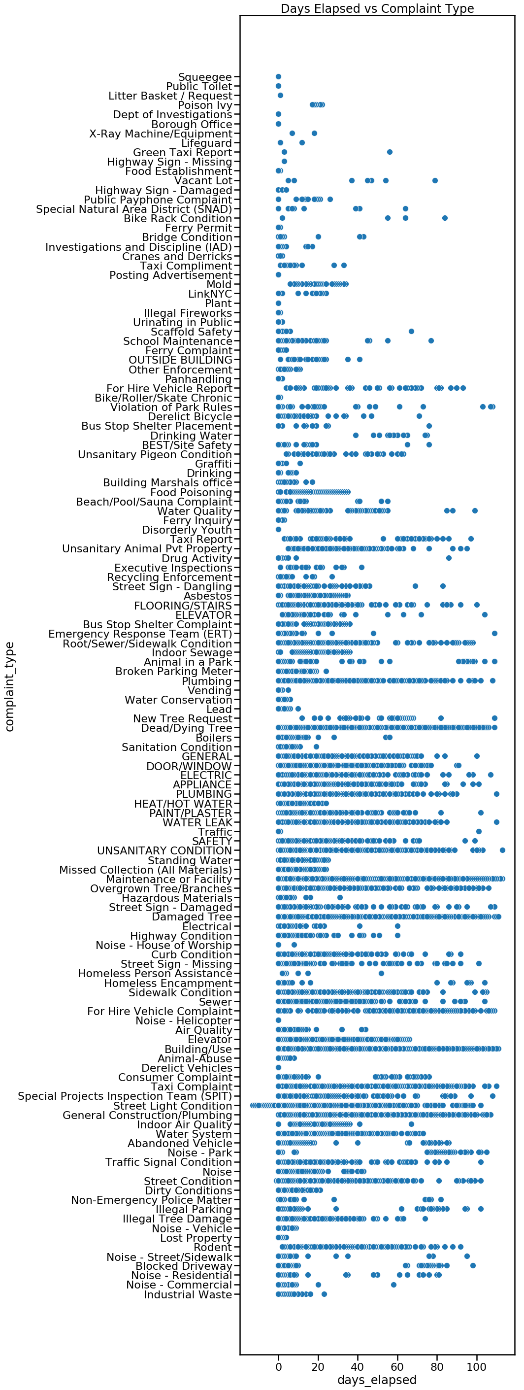
(aug[‘closed_date’] – aug[‘created_date’]).dt.days returns an integer where we can make visulizations. A scatter plot of raw data of complaint type and days_elapsed, shows the spread of how long a specific type of complaint took to resolve.

plt.figure(figsize= (8,40))
sns.scatterplot(y=aug['complaint_type'], x=aug['days_elapsed']).set_title('Complaint Type vs Days Elapsed ')

We can also look at the raw data of days_elapsed vs agency in a scatterplot.

plt.figure(figsize= (8,16))
sns.scatterplot(y=aug['agency'], x=aug['days_elapsed']).set_title('Agency vs Days Elapsed')

Instead of raw data, perhaps the mean will be more insightful. This is done by first grouping our dataframe by complaint_type using aug.groupby([‘complaint_type’]). From there we can specify which feature we want to look at, in this case, days_elapsed. We find the mean of each complaint type by attaching .mean() to the end of our code thus far. Adding .sort_values(acending=False) will sort our values from highest to lowest.

complaint_mean = aug.groupby(['complaint_type']).days_elapsed.mean().sort_values(ascending=False)
complaint_mean

complaint_mean will return the complaint_type and the mean of days_elapsed. The first line complaint_mean returns is “For Hire Vehicle Complaint – 65.” We take the complaint_mean.values which is 65 in our first example and complaint_mean.index which is For Hire Vehicle Complaint in our first example. Using seaborn (sns) we set complaint_mean_values as X and complaint_mean.index as Y. Finally, plt.text(63, .2, r’$65$’) places text ’65’ at the end of the first bar. The specific number (65) is taken from complaint_means.

plt.figure(figsize=(10,50))
sns.barplot(complaint_mean.values, complaint_mean.index, alpha=0.8)
plt.title('Avg Days Elapsed By Complaint Type')
plt.ylabel('Complaint Type', fontsize=12)
plt.xlabel('Avg Days Elapsed', fontsize=12)
plt.text(63, .2, r'$65$')
plt.text(61.5, 1.2, r'$63$')
plt.text(58.5, 2.2, r'$60$')
plt.text(56.5, 3.2, r'$58$')
plt.text(53.5, 4.2, r'$55$')
plt.text(41.5, 5.2, r'$43$')
plt.show()

We can also group by agency and see if there is a noticeable difference between agencies. Which agency closes their requests the slowest or the fastest?

agency_mean = aug.groupby(['agency']).days_elapsed.mean().sort_values(ascending=False)
agency_mean
plt.figure(figsize=(10,20))
sns.barplot(agency_mean.values, agency_mean.index, alpha=0.8)
plt.title('Avg Days Elapsed By Agency')
plt.ylabel('Agency', fontsize=12)
plt.xlabel('Avg Days Elapsed', fontsize=12)
plt.text(32, 0, r'$34$')
plt.text(25, 1, r'$26$')
plt.text(22, 2, r'$23$')
plt.text(19, 3, r'$20$')
plt.text(12.5, 4, r'$13$')
plt.text(12.5, 5, r'$13$')
plt.text(10, 6, r'$11$')
plt.text(6.5, 7, r'$7$')
plt.text(1.2, 8, r'$2.6$')
plt.text(1.1, 9, r'$2.4$')
plt.text(1.1, 10, r'$2.4$')
plt.text(.2, 11, r'$1.5$')
plt.text(.6, 12, r'$0.28$')
plt.show()

Here is a visualization by borough. We can look at the total average of days_elapsed by borough. Does one borough address their 311 service requests faster on average than another borough? b_mean = b_mean[1:6,] eliminates “unspecified” borough which had the highest number of average days elapsed.

b_mean = aug.groupby(['borough']).days_elapsed.mean().sort_values(ascending=False)
b_mean = b_mean[1:6,]
b_mean

plt.figure(figsize=(10,10))
sns.barplot(b_mean.values, b_mean.index, alpha=0.8)
plt.title('Avg Days Elapsed By Borough')
plt.ylabel('Borough', fontsize=12)
plt.xlabel('Avg Days Elapsed', fontsize=12)
plt.text(6.5, 0, r'$6.88$')
plt.text(6.1, 1, r'$6.51$')
plt.text(5.9, 2, r'$6.32$')
plt.text(5.5, 3, r'$5.88$')
plt.text(5.2, 4, r'$5.65$')
plt.show()

We can break this down further and take a look at how diligently each agency performs based on borough. Our first line of code, takes the variable bronx and returns a dataframe of 311 service requests from the Bronx. This is repeated for each borough.

bronx = aug.loc[aug.borough=='BRONX']
brooklyn = aug.loc[aug.borough=='BROOKLYN']
manhattan = aug.loc[aug.borough=='MANHATTAN']
queens = aug.loc[aug.borough=='QUEENS']
staten = aug.loc[aug.borough=='STATEN ISLAND']

The following is repeated a total of five times for each borough.

agency_mean = bronx.groupby(['agency']).days_elapsed.mean().sort_values(ascending=False)
print(agency_mean)
plt.figure(figsize=(5,10))
sns.barplot(agency_mean.values, agency_mean.index, alpha=0.8)
plt.text(49, .025, r'$52$')
plt.text(27, 1.1, r'$30$')
plt.text(23, 2.1, r'$26$')
plt.text(16, 3.1, r'$19$')

plt.title('Bronx: Avg Days Elapsed By Agency')
plt.ylabel('Agency', fontsize=12)
plt.xlabel('Avg Days Elapsed', fontsize=12)
plt.show()

Here is our final visualization. TLC is consistently the slowest of all agencies to close their 311 service requests, as it has the highest average days_elapsed in 4 out of 5 boroughs. Dept of Hygiene and Mental Health (DOHMH) also alternates between the 2nd and 3rd slowest agency in all five boroughs. The agency that has the lowest average days_elapsed to close a 311 service request is the NYPD, which is the lowest in every borough.

More Predictive Models: K-Nearest Neighbors

K-Nearest Neighbors (KNN) is a supervised learning algorithm that is used for classification and regression. KNN predicts based on the distance between two points and assumes that the smaller the distance is between two points, the more similar they are. For prediction, KNN will calculate the prediction point and find the K closest points to it, then examine what class it belongs to. Whichever class has the majority, is what KNN will predict for the prediction point. Evaluation metrics for KNN are precision, recall, accuracy and F1-Score.

Again we are using the sklearn library and thus must import the library.

from sklearn.neighbors import KNeighborsClassifier
from sklearn.preprocessing import StandardScaler

We again set our X and y values. We will be predicting a positive or negative outcome based on the features of our data. Therefore we set y to resolution_outcome which will either be 0 (negative) or 1 (positive). X will be all the features of our data, except for resolution_outcome so we set X to everything except resolution_outcome by dropping it.

X = aug.drop('resolution_outcome', axis=1)
y = aug.resolution_outcome

So since KNN predicts based on the distance between two points, it is affected greatly by outliers and different types of measurements, for example inches vs centimeters. Scaling the data will make it unit independent will not be affected by the magnitude of different variables.

X_train, X_test, y_train, y_test = train_test_split(X, y, test_size=0.25, random_state = 3)

scaler = StandardScaler() 
scaler.fit(X_train)

X_train = scaler.transform(X_train)  
X_test = scaler.transform(X_test)

We use sklearn’s KNeighborsClassifier and .fit our X_train and y_train data. We then use the model to predict on our X_test data.

clf = KNeighborsClassifier()
clf.fit(X_train, y_train)
test_preds = clf.predict(X_test)

Finally, we take our predictions found in variable test_preds and compare it to our y_test. Using sklearn’s metrics library, we can easily calculate the precision, recall and accuracy score, but most importantly, the F1 Score.

from sklearn.metrics import precision_score, recall_score, accuracy_score, f1_score
def print_metrics(labels, preds):
    print("Precision Score: {}".format(precision_score(labels, preds)))
    print("Recall Score: {}".format(recall_score(labels, preds)))
    print("Accuracy Score: {}".format(accuracy_score(labels, preds)))
    print("F1 Score: {}".format(f1_score(labels, preds)))
    
print_metrics(y_test, test_preds)

Our initial KNN model returned a F1 Score of 0.6067 which is better than our inital logistic regression model’s F1 Score of 0.5935. We can optimize our F1-Score by changing the value of K. In the following image, if we set our K = 3, then K will be classified as red. However, if we set our K to 5, we would take a look at everything within the dashed line circle instead of the solid line. If our K =5, K would be blue.

Here is a function that will help us fin the best k value by continually iterating on the predictive model by changing k, until it finds the best F1 Score.

def find_best_k(X_train, y_train, X_test, y_test, min_k=1, max_k=25):
    best_k = 0
    best_score = 0.0
    for k in range(min_k, max_k+1, 2):
        knn = KNeighborsClassifier(n_neighbors=k)
        knn.fit(X_train, y_train)
        preds = knn.predict(X_test)
        f1 = f1_score(y_test, preds)
        if f1 > best_score:
            best_k = k
            best_score = f1
    
    print("Best Value for k: {}".format(best_k))
    print("F1-Score: {}".format(best_score))
find_best_k(X_train, y_train, X_test, y_test)

Best Value for k: 3
F1-Score: 0.6837

We have optimized our F1 Score from 0.6067 to 0.6837. Our best F1 Score is still from upsampling our logistic regression model which returned a F1 Score of 0.7299.

Optimizing Our Predictive Model: SMOTE

SMOTE stands for Synthetic Minority Over-sampling Technique. The main difference between SMOTE and resampling is that SMOTE will not only increase the size of the training data set, but will also increase the variety of training examples. Oversampling increases the size of the training data through repetition of the original examples. SMOTE creates new training examples based on the original training examples. If there are two examples near each other, SMOTE will synthetically create a third example found in the middle of the first two examples.

We import SMOTE from the imbalanced-learn library.

from imblearn.over_sampling import SMOTE

In our previous blog, we had to determine which is the minority class and which is the majority class. We learned that the positive variable was the minority class with 286 counts. We then manually resampled it by separating the different classes of our predicted variable and resampled it to have an equal number to the majority class. SMOTE on the other hand, will automatically oversample the minority class without the need for our supervised differentiation.

With SMOTE, after we split our data into training and testing data, we use imblearn’s library to set the sm variable to run SMOTE. Again, SMOTE synthesizes training data, so we only .fit_sample or train the X_train data and the y_train data.

X_train, X_test, y_train, y_test = train_test_split(X, y, random_state=3)

sm = SMOTE(random_state=3)
X_train, y_train = sm.fit_sample(X_train, y_train)

Finally, with our new synthetic data added to our original data, we run our original model. We use sklearn’s Logisitic Regression library and .fit or train our X_train and y_train data to create a logistic regression predictive model. We then use our model to .predict on X_test.

smote_lr = LogisticRegression(solver='liblinear')

smote_lr.fit(X_train, y_train)

smote_pred = smote_lr.predict(X_test)


# checking accuracy
print('Test Accuracy score: ', accuracy_score(y_test, smote_pred))

# checking accuracy
print('Test F1 score: ', f1_score(y_test, smote_pred))

Test Accuracy score: 0.752
Test F1 score: 0.7019

SMOTE returned a F1 Score of 0.7019 which is better than our initial F1 score of 0.5935 but still not better than our Upsample F1 score of 0.7299.

Optimizing Our Predictive Model With Resampling

We made a predictive model using Logistic Regression. The model yielded a F1 Score of 0.5935.

One of the things we can take a look at to optimize our model is…our data. Do we have a class imbalance problem? Are there more negative outcomes than positive outcomes or vice versa?

We can use sampling techniques such as oversampling the minority class or undersampling the majority class. This technique can help by producing a synthetic dataset that the learning algorithm is trained on. With this, it is important to still maintain a test set from the original dataset in order to accurately judge the accuracy of the algorithm overall.

In our last blog, we did test_train_split to separate our data into a training set and a testing set.

X_train, X_test, y_train, y_test = train_test_split(X, y, random_state=3)

Here we take our X_train and y_train and join them together using concat and name the dataset training.

training  = pd.concat([X_train, y_train], axis=1)

Now we find where the resolution_outcome is equal to 0 or negative and resolution_outcome is equal to 1 or positive.

# separate minority and majority classes
negative = training[training.resolution_outcome==0]
positive = training[training.resolution_outcome==1]

print('negative outcomes count: '+ str(len(negative)))
print('positive outcomes count: '+ str(len(positive)))

Here is our data:
negative outcomes count: 464
positive outcomes count: 286

Upsample/Oversample

Now using sklearn we will resample the positive variable by oversampling or upsampling it. Since the positive variable is the minority class (286 counts) we will oversample it to match the number of negative variables which has a count of 464.

from sklearn.utils import resample

# upsample minority
positive_upsampled = resample(positive,
                          replace=True, # sample with replacement
                          n_samples=len(negative), # match number in majority class
                          random_state=23) # reproducible results

We now join the negative and positive_upsample data and name the dataframe upsampled.

# combine majority and upsampled minority
upsampled = pd.concat([negative, positive_upsampled])

# check new class counts
upsampled.resolution_outcome.value_counts()

0: 464
1: 464

Using our upsampled data we set our X and y values. We will be predicting a positive or negative outcome based on the features of our data. Therefore we set y to resolution_outcome which will either be 0 (negative) or 1 (positive). X will be all the features of our data, except for resolution_outcome so we set X to everything except resolution_outcome by dropping it.


# trying logistic regression again with the balanced dataset
y_train = upsampled.resolution_outcome
X_train = upsampled.drop('resolution_outcome', axis=1)


upsampled_lr = LogisticRegression(solver='liblinear')

upsampled_lr.fit(X_train, y_train)

upsampled_pred = upsampled_lr.predict(X_test)

We use sklearn’s Logisitic Regression library and .fit or train our new X_train and y_train data. After our model is trained, we use it to .predict on our X_test data. Now we can check our accuracy and F1 Score and see if it has improved from our initial F1 Score of 0.5935.

# checking accuracy
print('Test Accuracy score: ', accuracy_score(y_test, upsampled_pred))

# checking accuracy
print('Test F1 score: ', f1_score(y_test, upsampled_pred))

Using upsampling has increased the F1 Score to 0.7299!

Downsample

Now we will downsample and see if the F1 Score is better than 0.7299. Downsampling or undersampling is done to the majority class.

print('negative outcomes count: '+ str(len(negative)))
print('positive outcomes count: '+ str(len(positive)))

Here is our data:
negative outcomes count: 464
positive outcomes count: 286

We will be downsampling the negative outcomes (464) which is the majority to the same number of the positive outcomes (286).

# downsample majority
negative_downsampled = resample(negative,
                                replace = False, # sample without replacement
                                n_samples = len(positive), # match minority n
                                random_state = 23) # reproducible results

# combine minority and downsampled majority
downsampled = pd.concat([negative_downsampled, positive])

# checking counts
downsampled.resolution_outcome.value_counts()
# trying logistic regression again with the balanced dataset
y_train = downsampled.resolution_outcome
X_train = downsampled.drop('resolution_outcome', axis=1)


# downsampled_dt = DecisionTreeClassifier(max_depth=5)
downsampled_lr = LogisticRegression(solver='liblinear')


# downsampled_dt.fit(X_train, y_train)
downsampled_lr.fit(X_train, y_train)


# downsampled_pred = upsampled_dt.predict(X_test)
downsampled_pred = downsampled_lr.predict(X_test)


# checking accuracy
print('Test Accuracy score: ', accuracy_score(y_test, downsampled_pred))


# checking accuracy
print('Test F1 score: ', f1_score(y_test, downsampled_pred))

Downsampling returned a F1 Score of 0.7207 which is better than our initial F1 Score of 0.5935 but not better than our Upsample F1 Score of 0.7299.

Design a site like this with WordPress.com
Get started